Nowadays, the amount of available information on websites that are found on the internet is massive, nonetheless online communication technologies continue growing. It is needed and inevitably to start thinking about the development of a responsiveness site. (Responsive Design)
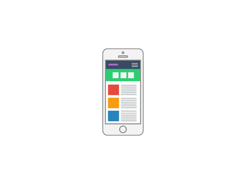
Responsive Design | What is it?
Also known as responsive website and adaptive web design, are pages developed in order to be adapted to any device that has internet access. An example of these devices are smartphones, tablets, IPads, etc.

This idea was developed because it was not convenient to own several sites or apps for each platform, on the contrary, it is better to embrace all the traffic on the same site and by means of this procure resources optimization and reduce developments´ time and cost, among other things.
Statistically, testing nowadays the vast majority of searches done on the internet correspond to portatil smart devices. Taking into account this wide market counts. It would mean the visit and stay of a greater number of users of your website.
Responsive sites were a phenomenon that emerged together with the evolution of different mobile devices or computer external with the aim of accessing the internet. Its purpose is to cause a pleasant visual sensation and a greater usability from users that visit sites on the internet.
The possibilities to broaden the market having a responsive site are huge as well as its benefits. It is also possible to subsume every query and host our company´s information inside a unique website, simplifying contact methods and minimizing employees´ work.
What are you waiting for to have your own Responsive Website?
Get a custom pricing for your project for ¡FREE!
Responsive Design | Benefits
Among the advantages that a responsive site has, it is possible to highlight that its interface adapts in a friendly way to any mobile device that has internet access. This benefits users since they have the possibility to access the same information that the website offers independently of the device they are using to enter the site. Investing in a responsive website might save you development´s time and money, generating a unique site that can be seen by anyone.
On the other hand, a responsive site, does not need to detect the type of browser that the user has to show the site in an optimal way, it simply offers the same functions and privileges that any user would have when using a computer.
Responsive design deletes compatibility problems already seen in applications for phones that need a specific development for each operating system ( Android, IOS, etc) and each version might be different to the other, in the graphics as functional. This way we manage to make available information consistent for all platforms

Many times when we enter a specific site from our devices, we can access a mobile version, that not always shows the correct visualization because they were developed for particular brands or models that do not correspond to the one that is needed, for example IPhone, Samsung or BlackBerry. That is why it is not possible to get an optimal quality site.
Another characteristic of responsive sites is that they avoid divided traffic increasing the number of users that interact with the same information. Not generating the same content for different types of devices, makes search engines like Google value your site in an adequate way improving its positioning in organic searches. This makes the task simpler and it is possible to benefit from SEO Positioning.
Tecnoarea offers an optimized responsive site for all visioning platform in each project. These sites are developed from state-of-the-art technologies that allow the viability of the adaptive web design.